
The case for real estate investing.
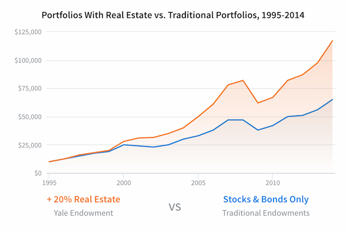
An investor who followed the Yale model of investing 20% of their portfolio in alternatives like real estate would have earned about 2x as much as an investor who used a traditional allocation.
Better returns. Lower risk.
Risk and returns across major asset classes in the last 20 years.

Source: Thompson-Reuters Datastream, Data from 1993-2013
What makes real estate such a strong investment?
Cash flow
Real estate produces cash flow from rental income unlike most stocks. Although bonds can generate regular cash, commercial real estate is a stronger alternative.
Asset Value
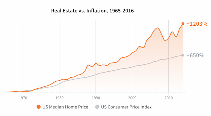
Real estate assets have historically appreciated over time given land scarcity. As populations grow, the demand for land rises and supply is limited by geography.
Holding through loan payoff can produce strong returns
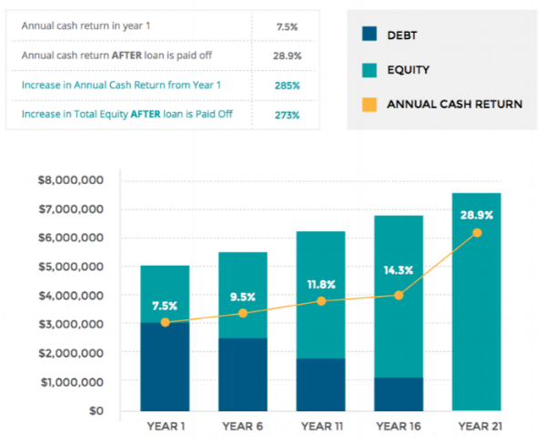
Simplified analysis assumes 20 year fully amortizing loan, 2% annual NOI income increase, and 65% LTV.
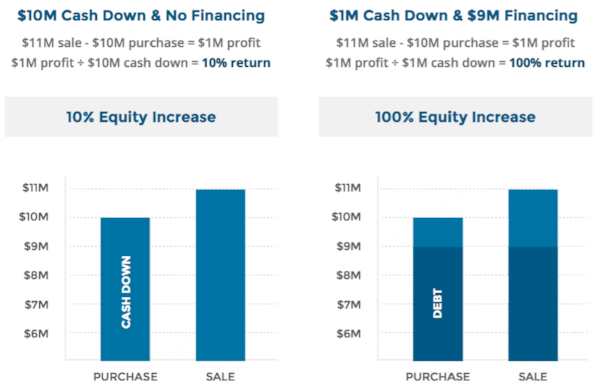
Leverage magnifies your returns.
Let's talk.
Hi there. This is the part of the website where my lawyer advises me to disclose everything in the world to make sure I don't get sued for misleading you. An if you're reading this far that means you're either 1) a lawyer or 2) a curious human or 3) an investor wanting to invest millions of dollars in Austin. I'm glad you found me. :)
Real Estate vs Traditional chart represents the growth of a hypothetical $10,000 investment in the Yale Endowment (“Yale Endowment”) versus the same hypothetical investment made into an average endowment with at least $1 billion under management (“Traditional Endowments”).
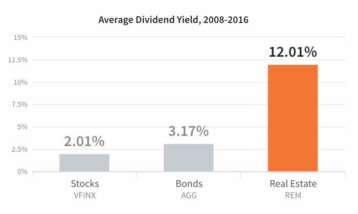
Average dividend yield chart represents the average annual dividend yield for the Vanguard 500 Index Fund (VFINX), the iShares Core Aggregate Bond ETF (AGG), and the iShares Mortgage Real Estate Capped ETF (REM), from 2008 to 2016. Source: Yahoo Finance
Real Estate vs Cash Flow chart represents the growth in percentage of the Median Sales Price for New Houses Sold in the United States and the Consumer Price Index: All Items for the United States from 1965 to 2016. Source: Federal Reserve Bank of St. Louis Economic Data.